Interaction Design
The app was a big project that involved three product managers, three UX designers, our IT department and in partnership with Cognizant and one of its subsidiaries.
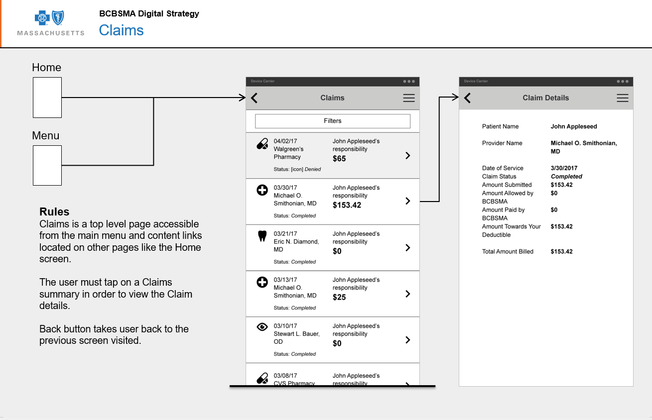
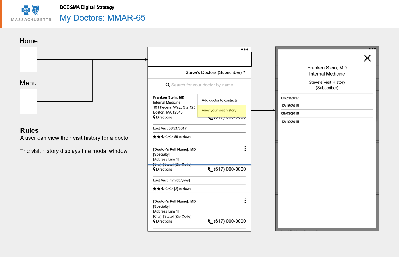
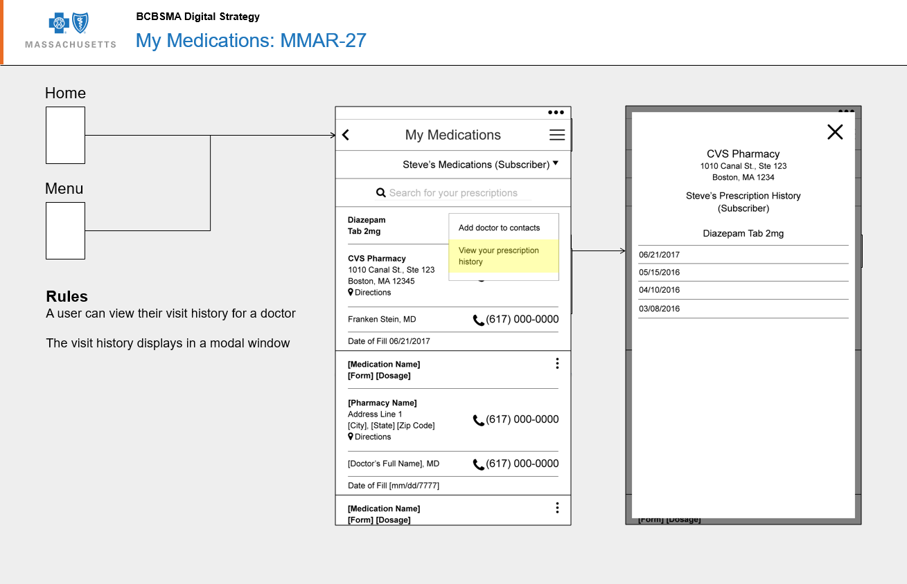
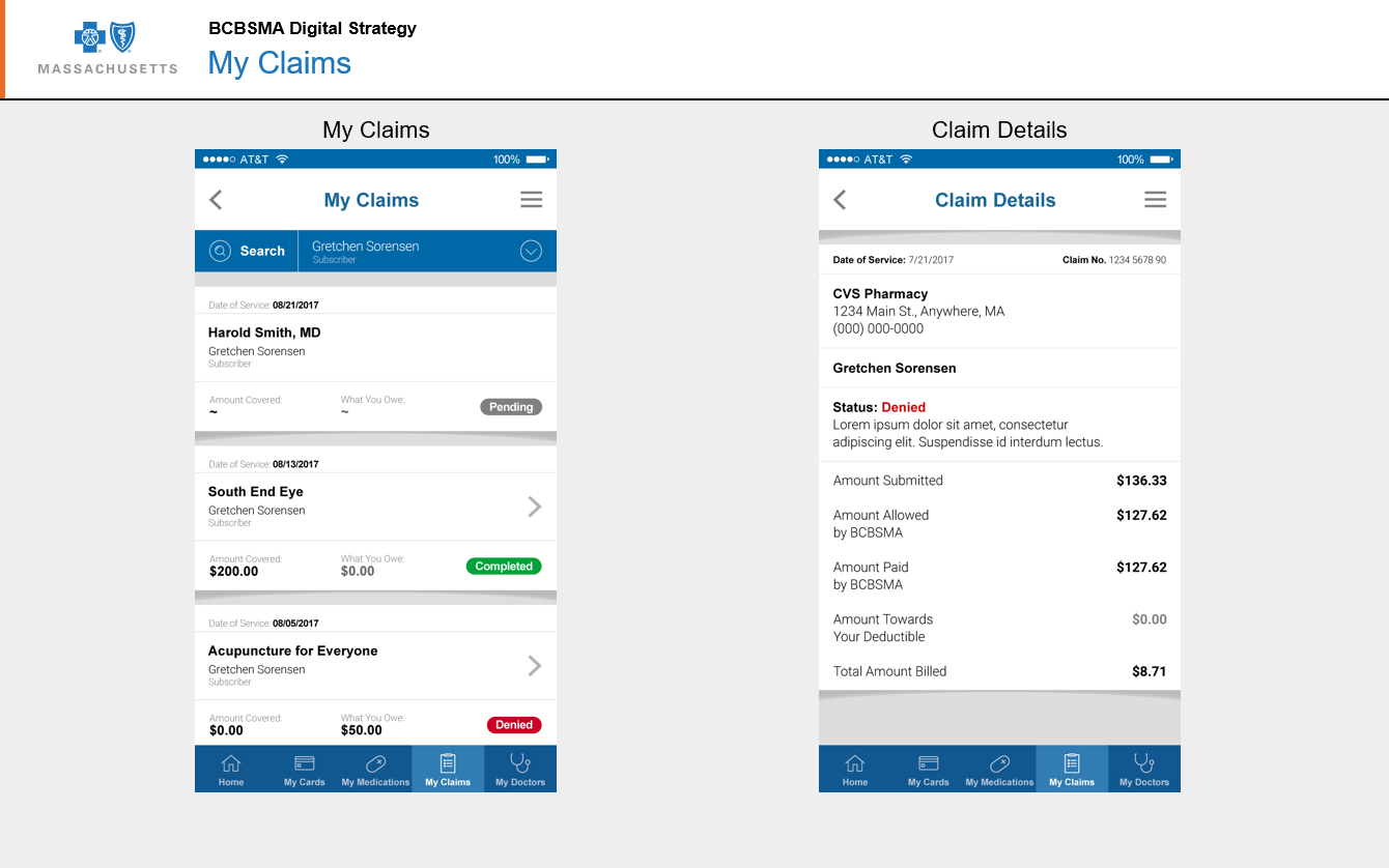
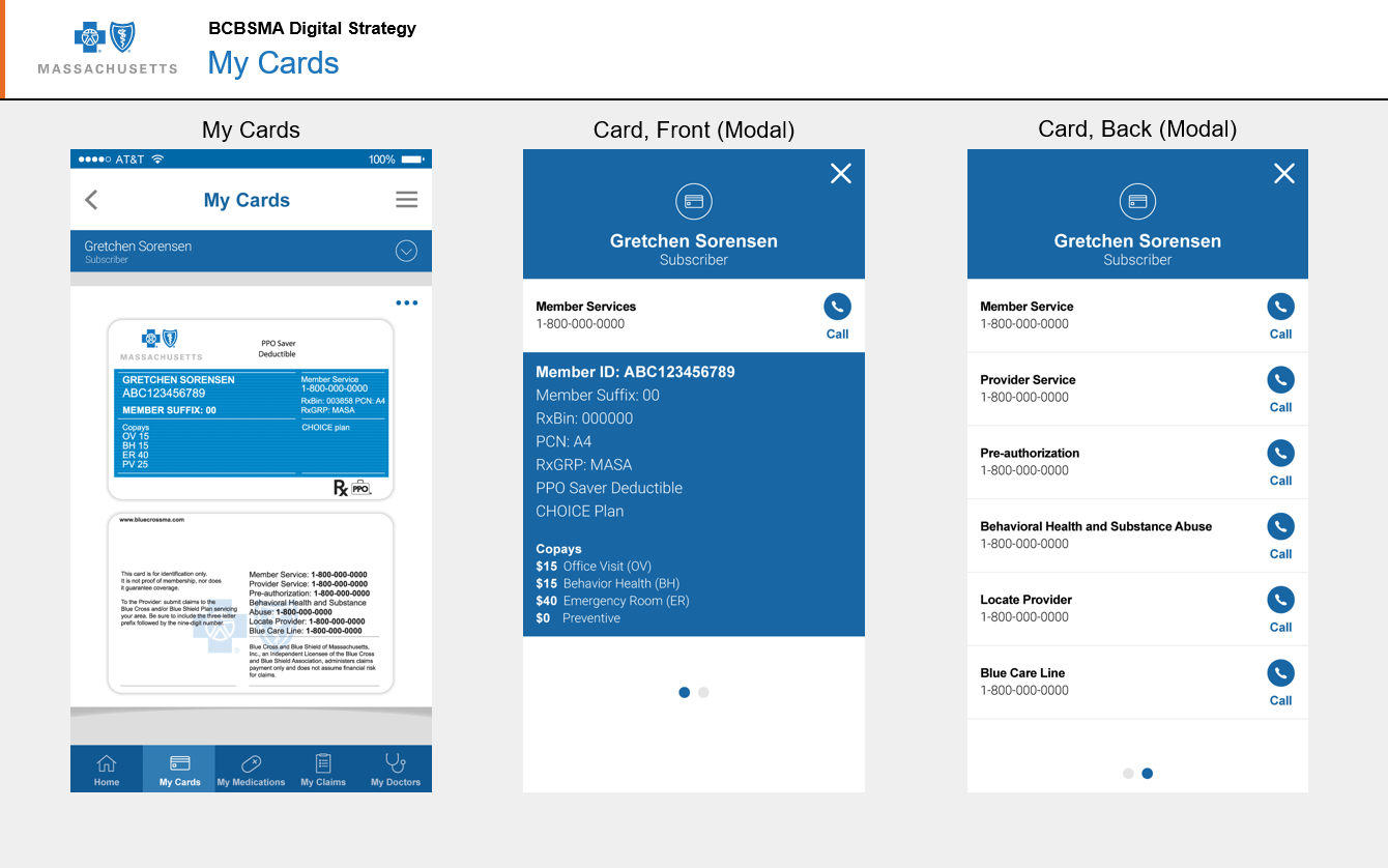
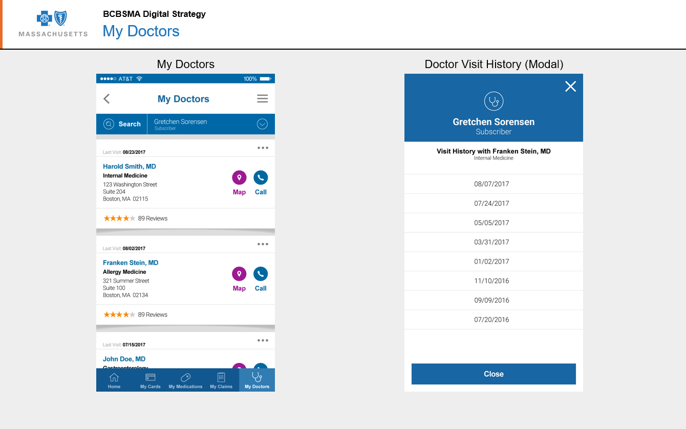
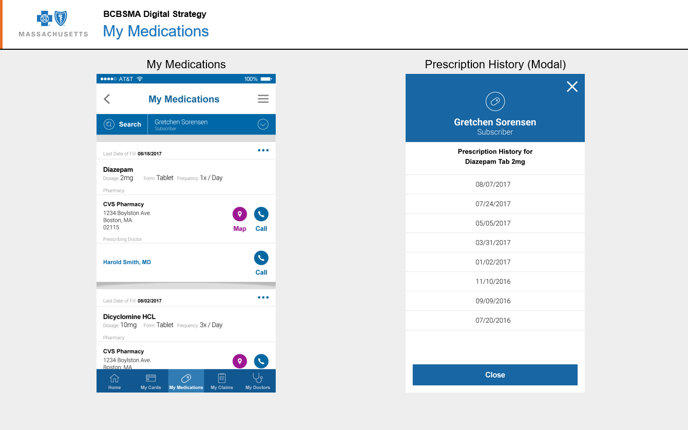
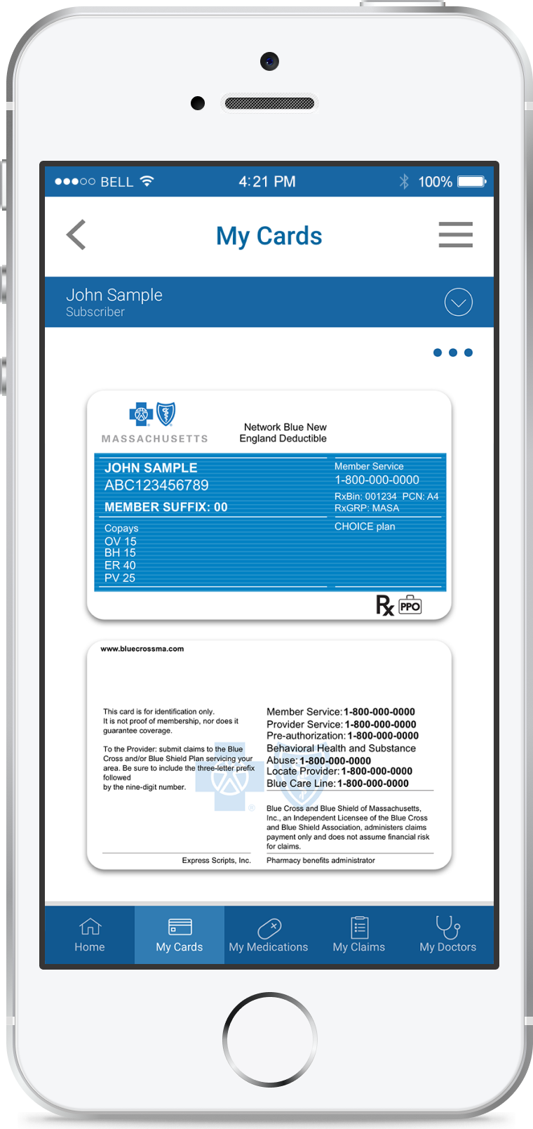
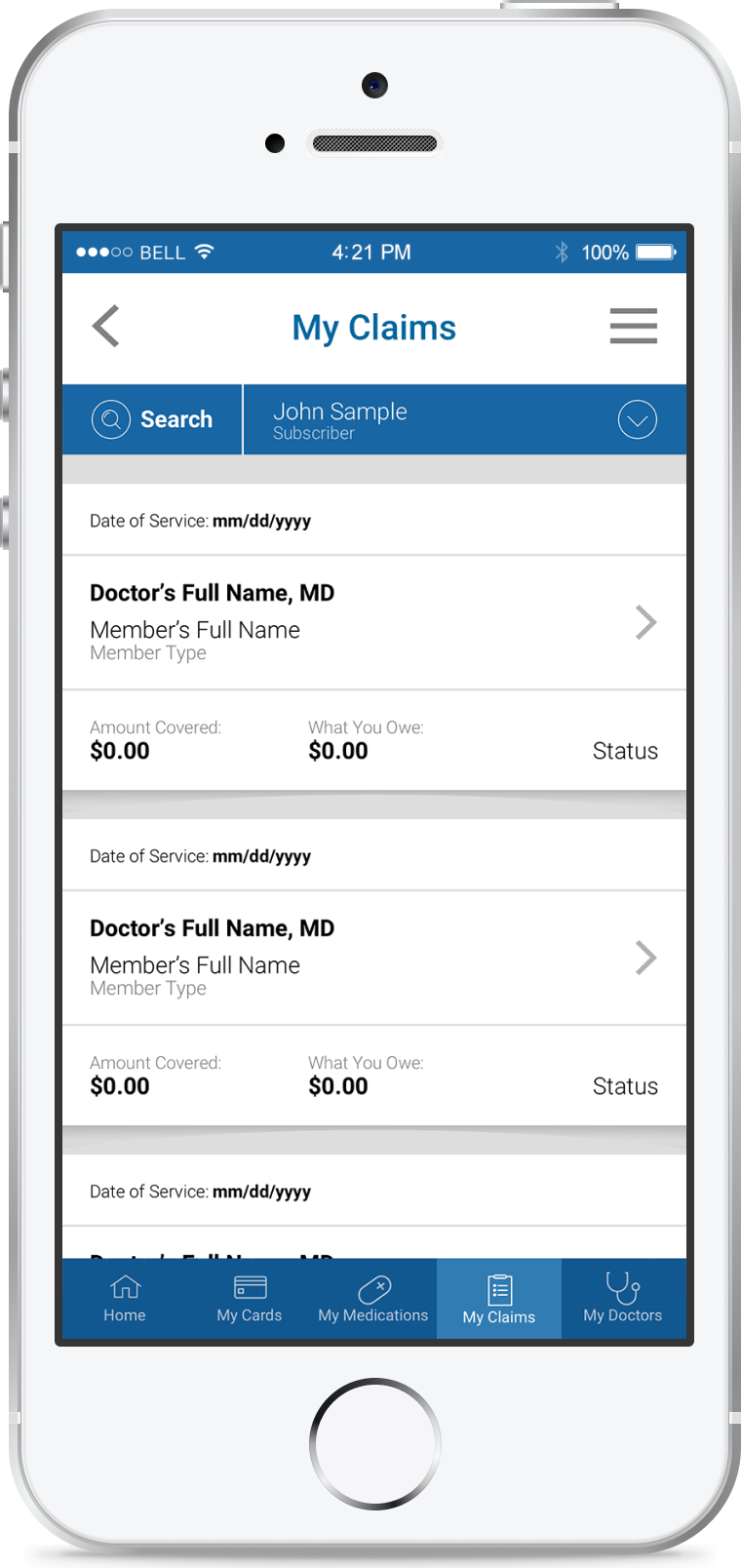
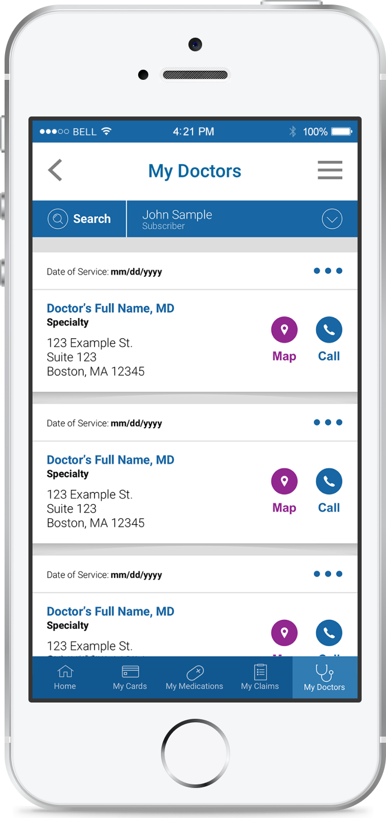
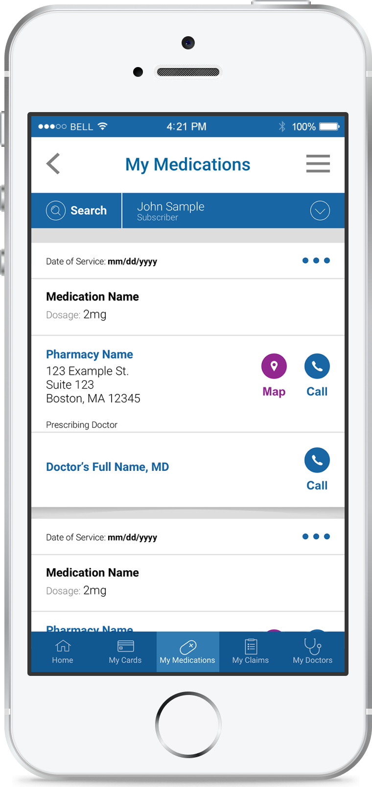
Originally I was responsible for My Financials which would have allowed users to pay bills online using their healthcare financial accounts, but the feature was de-prioritized when we learned the APIs wouldn't be ready. So I took on four other features: My Cards, My Claims, My Doctors and My Medications.
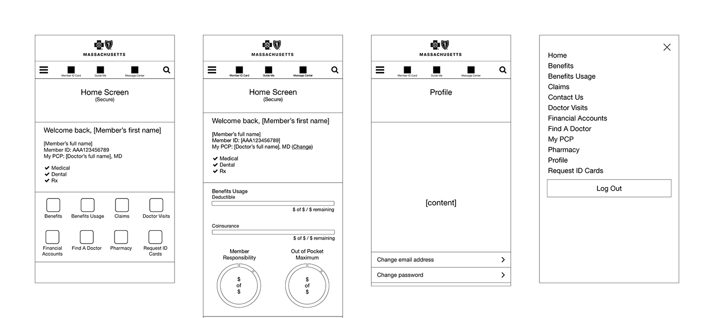
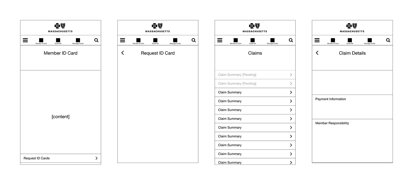
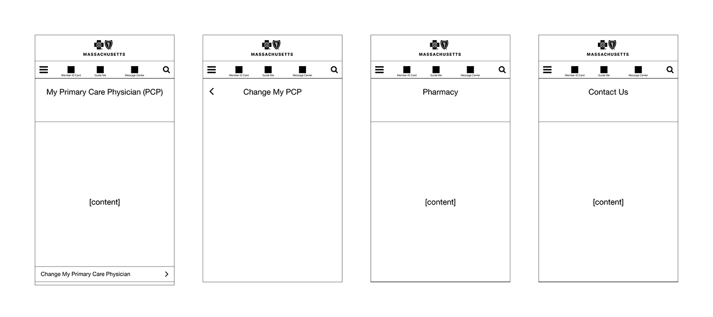
Early Wireframe Screens
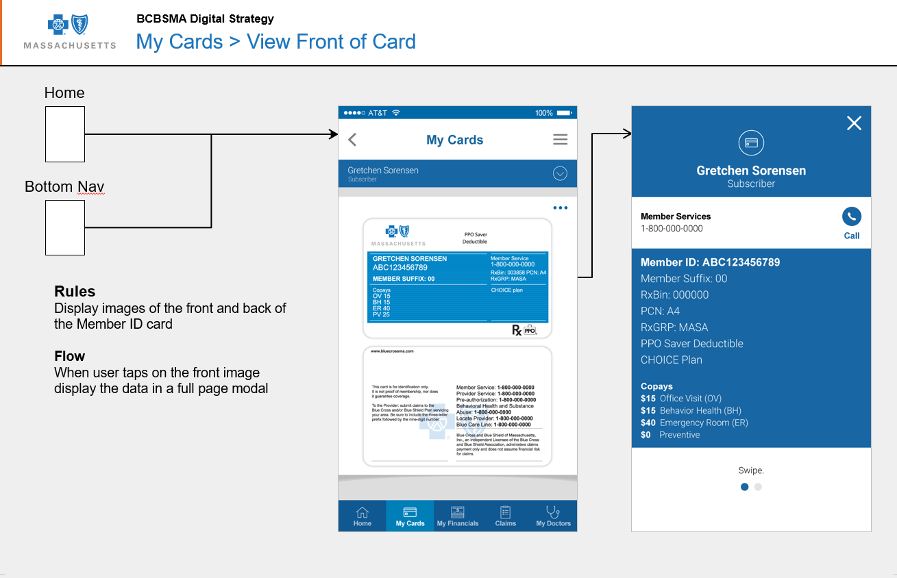
Wireflows
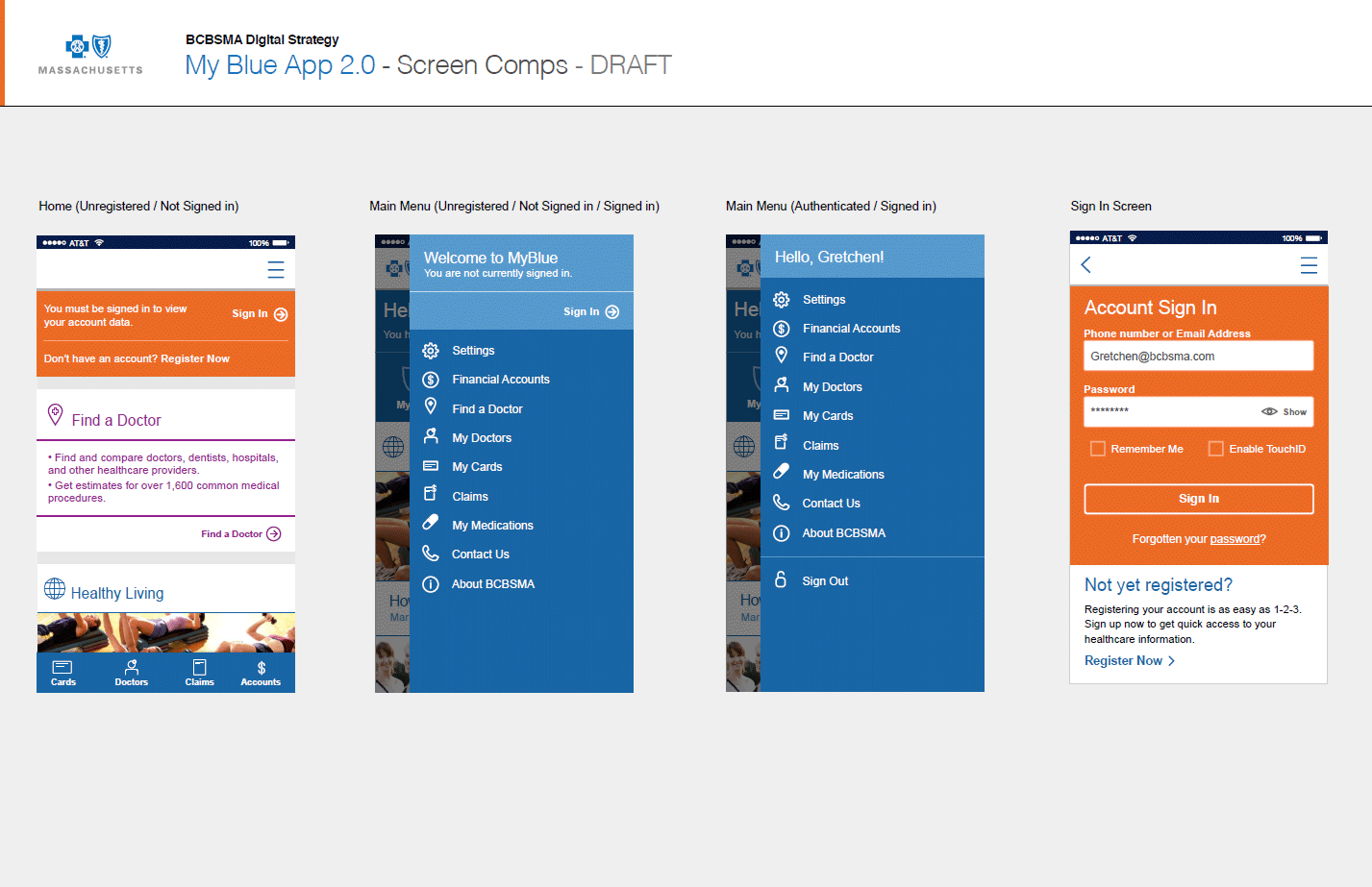
Visual Design
First Iteration
Final Iteration
Due to financial and technical constraints we did not use the native iOS and Android component libraries. Instead we designed a common user interface for both apps. The one exception was the position of the tab bar, where I followed iOS and Android patterns (located at the bottom for iOS and at the top for Android).
Outcome
While the first deployment of the app took almost a year instead of four months, we successfully deployed the second version of the app in Q1 2018.
This release positioned us so we could quickly iterate on these features that would allow users to take real action, such as pay for doctor visits, renew prescriptions and order new ID cards.
View The PrototypeMy Role
- Design System
- Prototyping
- User Testing Support
- Visual Design
- Wireframes
Collaboration Partners
- Business Analysts (2)
- Designers + Me (3)
- Engineering Leads (2)
- Engineers (4)
- Product Managers (3)
- User Researcher
Tools
- Adobe
- Invision
- PowerPoint
- Sketch
Duration
- 1 Year for v2 (2017-2018)
- 3 months for v2.1 (2018)
- 3 months for v2.2 (2018)
